Quark rebranding struggle
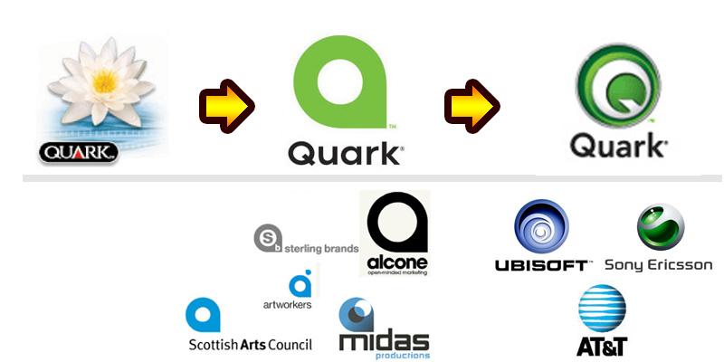
Quark's rebranding approach is on the best way to the "Top 10 ways how NOT to do it" book.
After the ill-fated rebranding in September 2005, Quark has decided to ditch the logo and come up with a new one yet again.
This time the logo was handled by Quark's own internal creative team. Even though the result is now much better than the 9/2005 version, which was almost identical to the "Scottish Arts Council", there is now a close resemblence with the Sony-Ericsson logo.
Maybe if Quark invested more effort in updating their software than changing the corporate identity there would be less frustrated Quark users among us. ;)
posted by Wurmik at
1:28 pm
![]()
![]()

0 Comments:
Post a Comment
<< Home